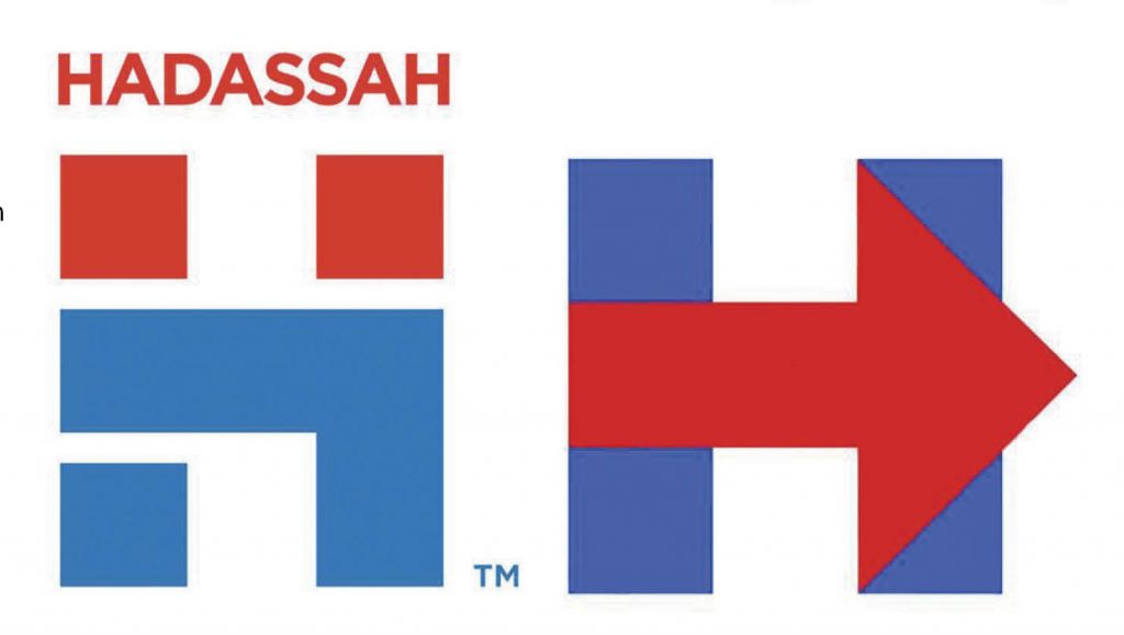
Hey! Whose logo is that?
Critics love to nitpick Hillary Clinton’s personal and policy choices, as they have during the recent email scandal and the Benghazi kerfuffle.
This time, however, the critics may have a substantial case against her.
As soon as Clinton’s campaign was launched, her logo was lampooned from all sides. Some called it too simple, others thought it looked too corporate.
Some were just confused that it features a red arrow pointing to the right — a feature that seems to contrast the blue and left tropes of the Democratic party.
The usual critics, however, did not seem to notice that the logo shares an awful lot with Hadassah’s new logo, which was unveiled in January.
The logos share the capital letter “H,” the red and blue color scheme, and an angular, geometric style.
Hillary’s logo does not incorporate the Hebrew letter hey, although Hadassah’s does. Is she taking the Jewish vote for granted?
comments